Gloria van Weerden portfolio photo
Gloria van Weerden

Rathfon Design

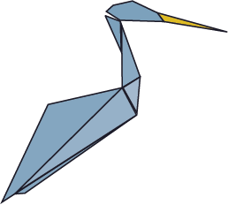
This logo originally came from the family drafting and machining business. I decided to make it my own for what the heron symbolizes. These birds portray determination and balance. For me, User Experience design is a balancing act, trying to identify weights on an experience and how to counteract them.

Rathfon logo

The final goal of this project was to create and compile a complete branding guide for ourselves. This included creating a logo, selecting colour schemes, and general rules of use. These were to be presented in an InDesign file and submitted as a clickable PDF. If you would like to see this finished product, you can check it out using the button below.

View Branding Guide

Logo

For any company branding, the logo sets the tone for the whole company image. The original logo for the company was a clipart of a heron with Times New Roman font. I kept with the heron, so blue was a natural choice. While blue is known for instilling trust, yellow was a good way of still portraying innovation. The slight variations of the blue, within the bird unwittingly draw the eye.

I broke down the heron into geometric shapes as a nod to my love of Tanagram puzzles. My love of puzzles is part of what I enjoy in User Experience design, because it is not just about what vision you have, but understanding how the pieces fit together for the final project.

Tools Used

Adobe InDesign
Adobe Illustrator
Critical Thinking
Colour Theory