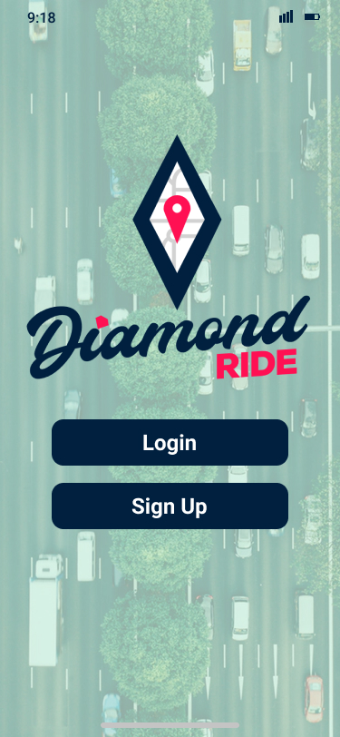
The inspiration for the name and logo came from the commuter's diamond lane. The colours were meant to instill trust since it was what people were scheduling their rides on.
User Research
The first step was the research to out what could be a solution for traveling outside Brantford. We interviewed many students and some Brantford residents who often commuted. From here, we could properly phrase a question to answer. From there, we decided on a ridesharing app. With it, we could create more of a community approach, with recurring rides for people who wanted to go home from school.
We drew up user personas, including people with some or little rideshare experience. Along with each person, we drew up an empathy map. This highlighted emotions they might feel about the issue we were trying to solve and their goals if such an app were to exist. From here, we could pinpoint their concerns and possible fears in ride-sharing, and work to combat them.
Ideation and Creation
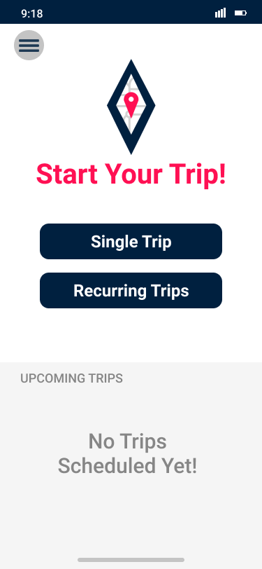
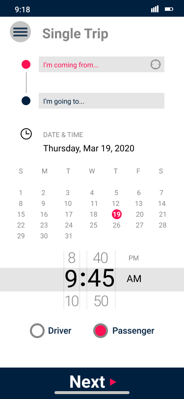
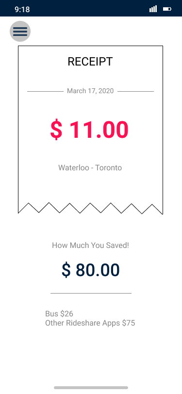
Since we knew what the user might be looking for, we started researching similar existing products, like Uber. We made some rough sketches that we used in our testing. Uber was a good option to work off of since it is widely used. The changes we had to make, however, was to make it an app used between two peers instead of a driver and passenger. We also added the option of recurring trips, so to build up a sense of community. It was easy to find participants because we were targeting university students. We carried out our practice tests on paper. These were easy to manipulate and redesign after the testing. The testing involved giving the participant tasks, and observing how they responded to each one. When the tasks were completed, we asked general questions about their thoughts, and specific questions on areas they had trouble with. After some reworks and retesting, we came up with our final mockup in Figma for presenting to the class.
