Background
The William and Mary College had a vision they wanted to bring to life. They had begun to build a free, open-source, and frequently updated research-sharing platform to bridge the knowledge-action gap. During the testing of the prototype, users found the product overwhelming. We worked with the university’s representative Dr. Sabo and conservation specialists to develop an alternative product based on user needs.
Formative Research
We began seeking out conservation specialists for interviews. Pooling the team's resources and connections, we recruited a wide variety of practitioners, including:
- Forestry Technicians
- Wildlife Outreach Professionals
- Conservation Education Specialists
- Aquatic Biologists
- Environmental Conservationists
- Geo-statistical Consultant
- Conservation Educators
We spoke with our participants about their daily tasks, what means they used for communication and research, and the struggles they faced in their positions. From these sessions, we uncovered that their is nearly too many resources for practitioners. Weeding through the results of a query was time consuming and it was nearly impossible to find resources specific to location. This also meant missing out on possible colleges working on similar projects in the same area.
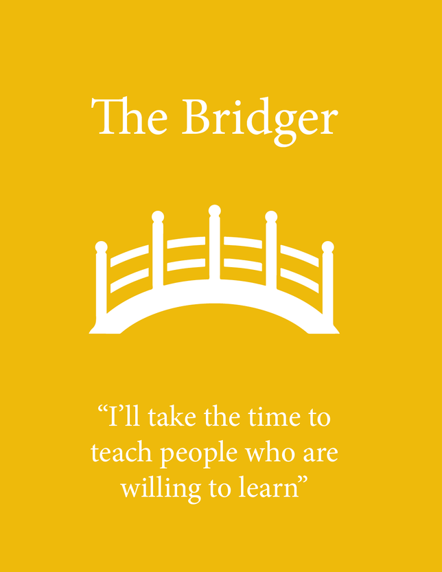
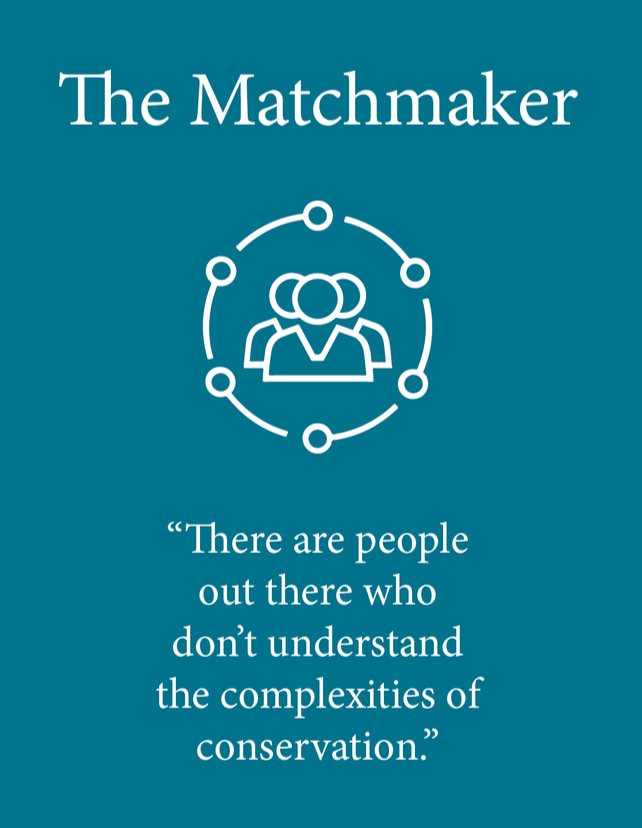
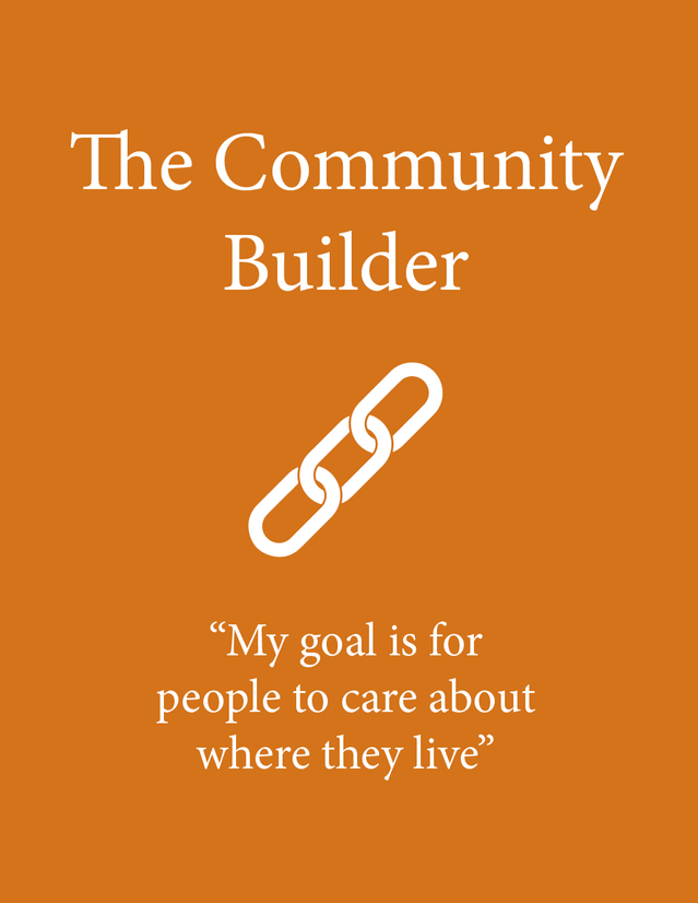
Common themes were traced in order to create our personas to represent users.
Prototyping
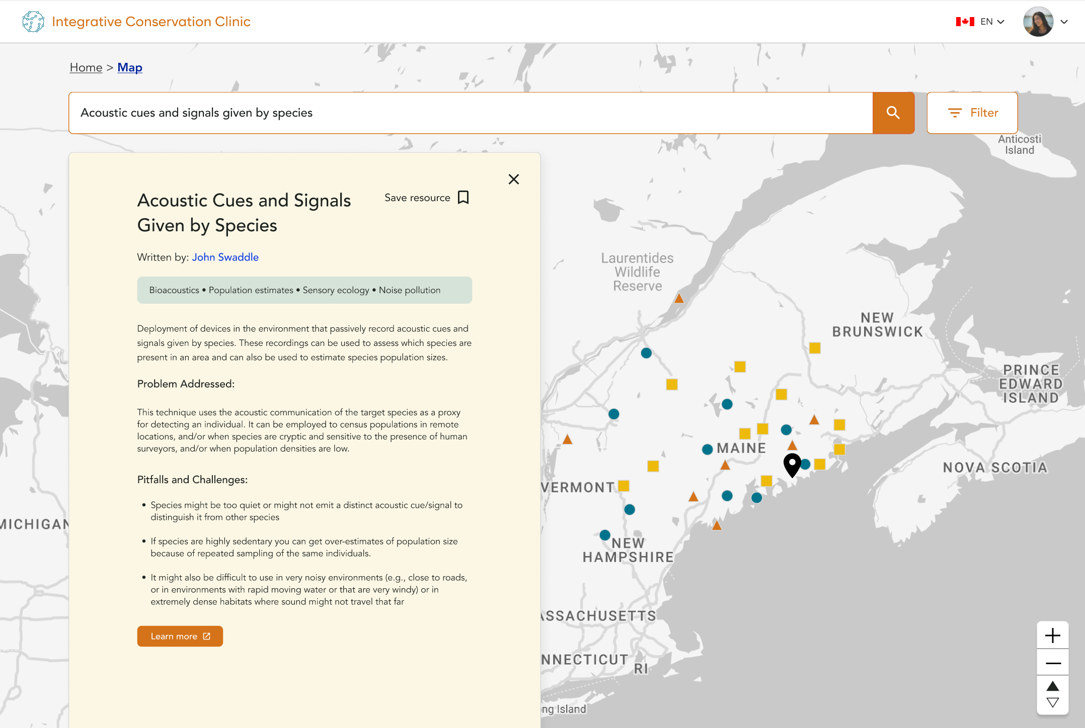
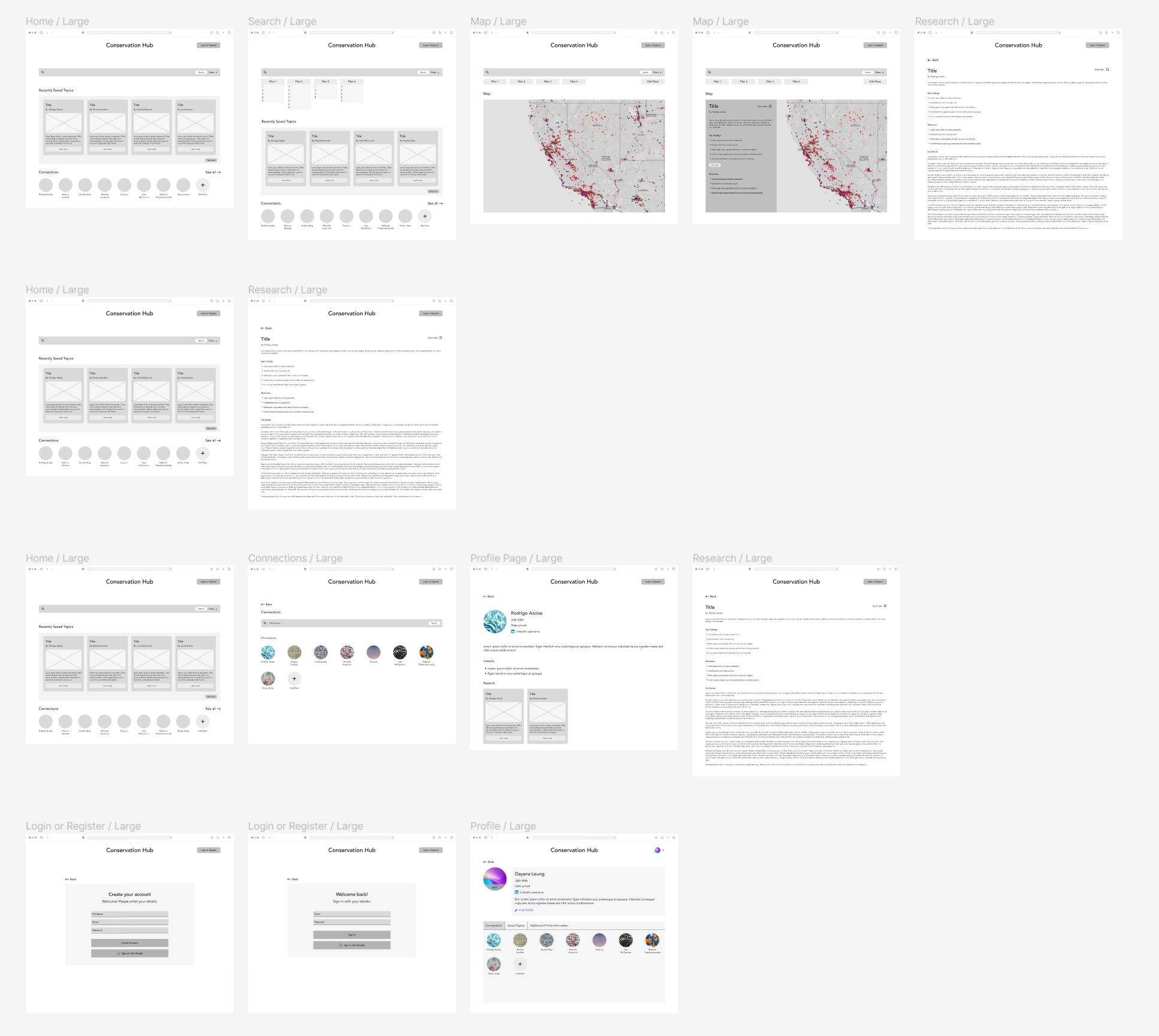
Armed with data, we began with ideation and low-fi prototyping. We began with card sorts and tree testing. These results informed our general information architecture for the site. Once we felt confident in the structure of our site, we wrapped up our low-fi prototype. We expanded the simple skeleton by adding pages, a profile section, and a location for saved resources.
Usability Testing
After recruiting more users, we began with our usability testing. On our mid-fi prototype, we tasked our users to search our site for a resource, save it, find the saved resources, and connect with the author of the resource. Our testing found that users were able to search and use the map function, but found the path to saved resources and connections a problem. We took the feedback from our users and spun it into our next round of prototypes.
Round two of usability testing had us exploring how users would interact with our search filters and map indicators. Users were successful in all the tests we completed. This gave us the confidence to push a head with our current designs.
Our last round was the team testing all of the tasks we had previously. Both qualitative and quantitative data showed users found a vast improvement in the new product. After putting on the finishing touches, we were excited to show our design to our clients.
Conclusion
After seven months of research, prototyping, and testing, we presented our findings before our peers and Scotiabank sponsors. Our hard work paid off, as we were given first prize by our client and Scotiabank mentors. This tool for conservation practitioners would give them access to resources and personal connections. Our goal was to create an all-encompassing hub for learning and professional connections. The personal connections would develop through our map function, giving users the ability to see who else is doing research in their area.
